Tracking SARS-CoV-2 imports using massive genomic datasets
What you will need:
-Python 3.6 or later
-Pandas
-DendroPy
Optional:
If you have not installed Python already, I highly recommend installing the Anaconda distribution of Python. You can check if conda was correctly installed by typing conda -V at the command line (Terminal on a Mac). Anaconda comes with many standard scientific libraries, including Pandas.
We will also need to install DendroPy for this tutorial, which can be installed through conda using conda install -c bioconda dendropy. If you did not install Anaconda, directions for installing DendroPy can be found here.
SARS-CoV-2 genomes on GISAID
In this tutorial we will use SARS-CoV-2 genome sequences publicly available through GISAID to track the movement of viral lineages in and out of North Carolina. As of April 6th, 2022, there were over 10 million SARS-CoV-2 genomes sampled globally on GISAID. Just from the US alone there are more than 3 million genomes and 70,976 from North Carolina.
Because the global dataset is far too large to realistically work with here, I have created a smaller dataset with 10,000 randomly sampled genomes from the US and another 10,000 randomly sampled genomes from NC. You will get a chance to see how we can use Python to easily subsample from larger datasets later in this tutorial.
In the first two sections, we will reconstruct and date a maximum likelihood (ML) phylogeny for these 20,000 viral genomes using faster tree reconstruction and dating methods. I would however highly recommend not attempting to reconstruct or date the tree now during the tutorial session. Keep in mind that just a few years ago, this still would have been one of the largest pathogen genomic datasets ever assembled! With 20,000 genome sequences, it took RAxML nearly 48 hours to reconstruct a single tree. The reconstruction and dating steps are included just to illustrate the full process so that you can replicate it later on if needed.
If you are skipping these first two steps, you can download the dated ML tree I reconstructed here.
Reconstructing a ML tree in RAxML-ng
We will use RAxML-ng to reconstruct a ML phylogenetic tree for our 20,000 viral genome sequences. Instructions for installing RAxML-ng can be found here.
The sequence alignment for these genomes is in msa_0406_NC-10k_USA-10k.fasta. Due to restrictions on sharing data in GISAID’s user agreement, I cannot make the sequence data publicly available but can share them with you personally by request.
We will be running RAxML-ng from the command line, so remember that if you are not working from the same directory as the alignment file, you will need to provide the full path to the alignment file, i.e. you will need to replace the path_to_file stand-in below:
raxml-ng --search1 --msa /path_to_file/msa_0406_NC-10k_USA-10k.fasta --model GTR+G --prefix 10k --seed 12345
The –model GTR+G argument tells RAxML that we want to use a General Time Reversible (GTR) model of molecular evolution but allow for gamma distributed rate heterogeneity among sites. The –prefix argument tells RAxML what prefix to attach in front of the name of the output files. The –seed argument sets a random number to seed the tree search.
Note the –search1 argument included as the first argument. This tells RAxML to perform a very quick search to find that tree that maximizes the likelihood of our sequence data. This search strategy is very fast and uses some of the same heuristics as FastTree to limit the tree search but is far less exhaustive than RAxML’s standard search algorithm. While I would not recommend this option for building a publication quality tree, we’ll use it here to generate a tree that is hopefully just good enough given the large size of our dataset.
Fast dating with LSD
Now that we have our ML tree, we need to date it so that we have a time-calibrated tree with node heights in units of real time (i.e. years). We will use the Least Squares Dating (LSD) to date our tree, which as the name suggests uses a least-squares optimization approach to estimate node heights assuming a strict molecular clock. Instructions for installing LSD can be found here. Again, I would highly recommend not attempting to date the tree now, but rather just follow along in case you want to do this again in the future.
LSD will date the tree using the constraints imposed on the node heights by the tip dates, which here correspond to the sampling times of the viral genomes. LSD requires these tip dates be provided in in a tab-delimited file with one sample name and its corresponding date on each line like shown below:
seq1 2022-01-01
seq2 2022-01-02
seq3 2022-01-03
Easy enough, but we certainly do not want to do this manually for 20,000 samples. Let’s do this in Python using the powerful Pandas library. We have the dates for each sample in a metadata file from GISAID named metadata_NC-10k_USA-10k.tsv. So we can load this tsv file into a Pandas dataframe called df and then put the two columns we want (“Accession ID” and “Collection date”) into a new dataframe and then write this dataframe to tab-limited csv file called dates.tsv.
import pandas as pd

# Set meta data file and output file
meta_file = "metadata_NC-10k_USA-10k.tsv"
dates_file = "dates.tsv" # output file

# Read in meta data and put in pandas dataframe
df = pd.read_csv(meta_file,sep="\t")

# Extract only Accession ID and Collection date
df = df[['Accession ID','Collection date']]

# Write to tab-delimited csv file
df.to_csv(dates_file,sep="\t",index=False)
I’ve put the above code in a script called write_dates.py for future use.
A quirk of LSD is that it expects the first line of the dates file to contain the number of tip time constraints instead of column names. Here, we have 20,000 sample tips so we can just replace the column names in our .tsv file with “20000” using your favorite text editor. The first few lines of the date file should now look like this:
20000
EPI_ISL_6060952	2021-10-04
EPI_ISL_1373491	2021-03-19
EPI_ISL_4983340	2021-09-12
You can also directly download the dates.tsv file.
We are now ready to run LSD from by entering lsd at the command line. LSD should prompt you for your input tree and then ask if you have an input date file. Enter “y” for yes and then enter the name of the dates file: dates.tsv.

Once you enter your desired tree and dates file, LSD should prompt you again with a list of options for dating:
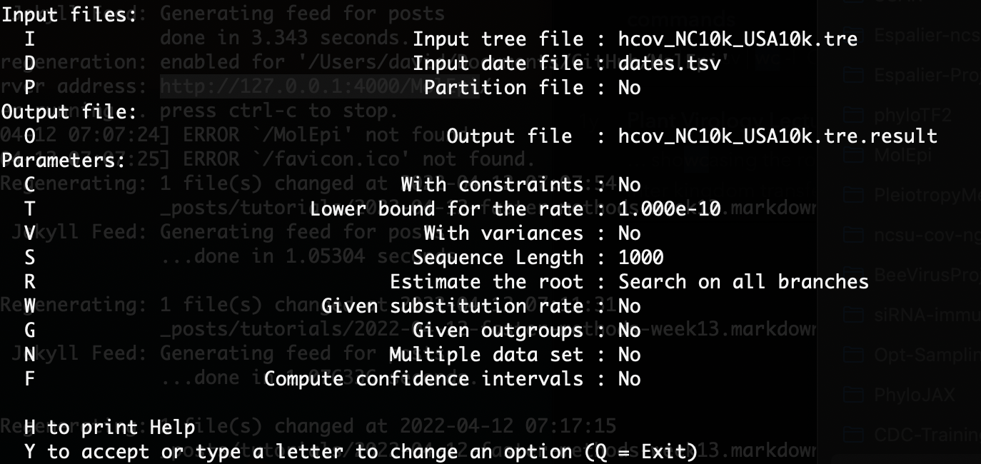
Here we want to enter “C” at the command prompt so we’re estimating the node heights with tip date constraints. Our ML tree is not rooted yet so we will leave the “Use fast method to search on all branches” option selected. However, since we have a pretty good idea of what the molecular clock rate is for SARS-CoV-2, we can specify a substitution rate by entering “W” and then entering a rate file. The rate_file.txt file I entered is a simple one line text file with the previously estimated clock rate of 0.0008 substitutions per site per year.
Once you have entered these options, the prompt displayed should look something like this:
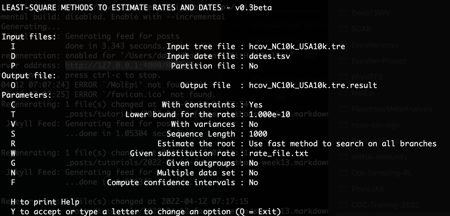
You can enter “Y” to run the dating. The dated tree file will be returned in an output file with the extension .result.date.nexus.
Identifying viral imports and exports
Ok, we’ve made it through the the computationally demanding part. You can download the dated ML tree hcov_NC10k_USA10k_dated.tre or use your own tree for the rest of the tutorial.
On to the fun part! Our goal now is to track the movement of lineages and identify the number of imports into and exports out of North Carolina. So our first goal will be to reconstruct the ancestral locations of internal nodes in the tree so that we can identify branches along which viral lineages moved in or out of North Carolina. We could of course do a fully Bayesian reconstruction using a discrete-trait phylogeographic model like we did way back in week 4 for Phytophthora infestans. However, since we have such a large tree here we’ll instead perform a very quick maximum parsimony reconstruction.
You can download the Python script reconstruct_movement.py to automate the whole reconstruction process. But for now let’s look at the code step-by-step.
The file metadata_NC-10k_USA-10k.tsv contains the metadata provided by GISAID for each sample. We will load the metadata into a Pandas dataframe and then extract the state for each location. The locations are provided in format like North America / USA / North Carolina, so we’ll use the fancy split then apply combo in the code below to extract the US state for each sample and put it in a separate State column in the dataframe:
#Read in meta data
meta_file = "metadata_NC-10k_USA-10k.tsv"
meta_df = pd.read_csv(meta_file,sep="\t")

#Get state-level location from location column
meta_df['State'] = meta_df['Location'].str.split('/').apply(lambda x: x[2].strip() if (len(x) > 2) else 'None') # direct way
state_counts = meta_df['State'].value_counts()
We can use the value_counts() function in the last line of the code to return the number of samples by state. Let’s look at the top 10:
North Carolina          10000
California               1760
Texas                     770
New York                  561
Colorado                  551
Massachusetts             538
Florida                   461
Minnesota                 390
Washington                318
Utah                      301
So by design we have the most samples from North Carolina, but note that we also have a far greater number of samples from states like California and Texas than from other states.
Next, we can load and work with our ML tree directly in Python using Jeet Sukumaran’s amazing DendroPy package:
# Load in tree using DendroPy
tree_file = 'hcov_NC10k_USA10k_dated.tre'
taxa = dendropy.TaxonNamespace() # must specify taxa namespace first
tree = dendropy.Tree.get(file=open(tree_file, 'r'), schema="newick", rooting="default-rooted", taxon_namespace=taxa)
We will use the reconstruct_MP function in reconstruct_movement.py to reconstruct ancestral locations using maximum parsimony. This function is a Python implementation of Sankoff’s parsimony algorithm. The function requires that we pass in two objects, our tree and a Python dictionary object that maps the tip names (accession IDs) to the tip states (locations). To create this dictionary, we will use a for loop to iterate over each row of our dataframe, creating a key:value pair for each tip name:state combo:
#Make a dict mapping tip names (key) to tip states (value)
tip_state_dic = {}
for index, row in meta_df.iterrows():
    tip_state_dic[row['Accession ID']] = row['State']
Now we can run the ancestral reconstruction:
# Run ancestral location reconstruction
tree = reconstruct_MP(tree,tip_state_dic)
This function seemingly doesn’t do much but the tree it returns contains the reconstructed ancestral states in each node’s node.state attribute. How do we access these node states?
When working with trees, one of the most useful things to know how to do is to iterate (loop) over and extract information from each node. DendroPy helpfully has iterators that allow us to loop over each node in a tree inside a standard Python for loop. We can iterate over nodes in order either using a post-order traversal (from tips to root) or a pre-order traversal (from root to tips). Here’s a simple example of how we could use a post-order traversal to iterate over each node and print its ancestral state:
for node in tree.postorder_node_iter():
	print(node.state)
What we want to do is a little more involved. We don’t want to just get the ancestral state of each node but rather find all of the branches in the tree where the parent and child node’s states differ due to a migration event. The following ancestral_changes function does just this: we iterate over every node in the tree using a post-order traversal, compare the node’s state with the node’s parent state, and record the time, origin (parent state) and destination (child state) of each migration event. Finally, we store all this information in a dataframe for later use.
def ancestral_changes(tree):
    changes = 0
    times = []
    origins = []
    destinations = []
    tree.calc_node_ages(ultrametricity_precision=False)
    for node in tree.postorder_node_iter():
        if node != tree.seed_node: # i.e. if not root
            parent_state = node.parent_node.state
            if node.state != parent_state:
                changes += 1
                times.append(node.age)
                origins.append(parent_state)
                destinations.append(node.state)

    print("Total number of state changes: " + str(changes))

    # Place events in dataframe
    df = pd.DataFrame({'EventTime' : times})
    df['Origin'] = origins
    df['Destination'] = destinations

    return df
To finish up here, we will call the ancestral_changes function on our tree with ancestral states and then write the changes dataframe to a csv file.
changes_df = ancestral_changes(tree)
changes_df.to_csv('anc_loc_changes.csv',index=False)
I’ve put all of this together in a single Python script called reconstruct_movement.py. You can run this from the command line as follows:
$ python reconstruct_movement.py
Plotting imports and exports by state
Next let’s plot the number of imports by state of origin and exports by destination. Again you can download the full plotting script plot_imports_exports.py and then follow along here.
First we will load back in the dataframe in which we stored the information about all the the migration events and split this dataframe into two: one for imports and one for exports. Pandas comes in handy here because we can filter entries we want to include based on the value of a particular column for each entry in a dataframe. Here for example, we want to find all of the imports into NC, so the Destination column for these entries should be North Carolina. Similarly, we can find all the exports from NC by looking for the entries with North Carolina in the Origin column.
# Split df into an imports and exports df
df = pd.read_csv('anc_loc_changes.csv')
imports_df = df[df['Destination'] == 'North Carolina']
exports_df = df[df['Origin'] == 'North Carolina']
Now we can plot all of the imports into NC by origin using the Seaborn package. Note that we use the value_counts function to bin all of the entries in the imports_df by their origin to get imports_by_state, which contains the number of imports for each state:
import matplotlib.pyplot as plt
import seaborn as sns

# Plot imports into NC
sns.set_theme(style="darkgrid")
fig, ax = plt.subplots(figsize=(8, 5))
imports_by_state = imports_df['Origin'].value_counts()
sns.barplot(imports_by_state.index, imports_by_state.values)
ax.set_ylabel('Imports into NC')
plt.xticks(rotation=90) # rotate xtick labels so readable
fig.tight_layout()
fig.savefig('nc_imports_per_state.png', dpi=200)
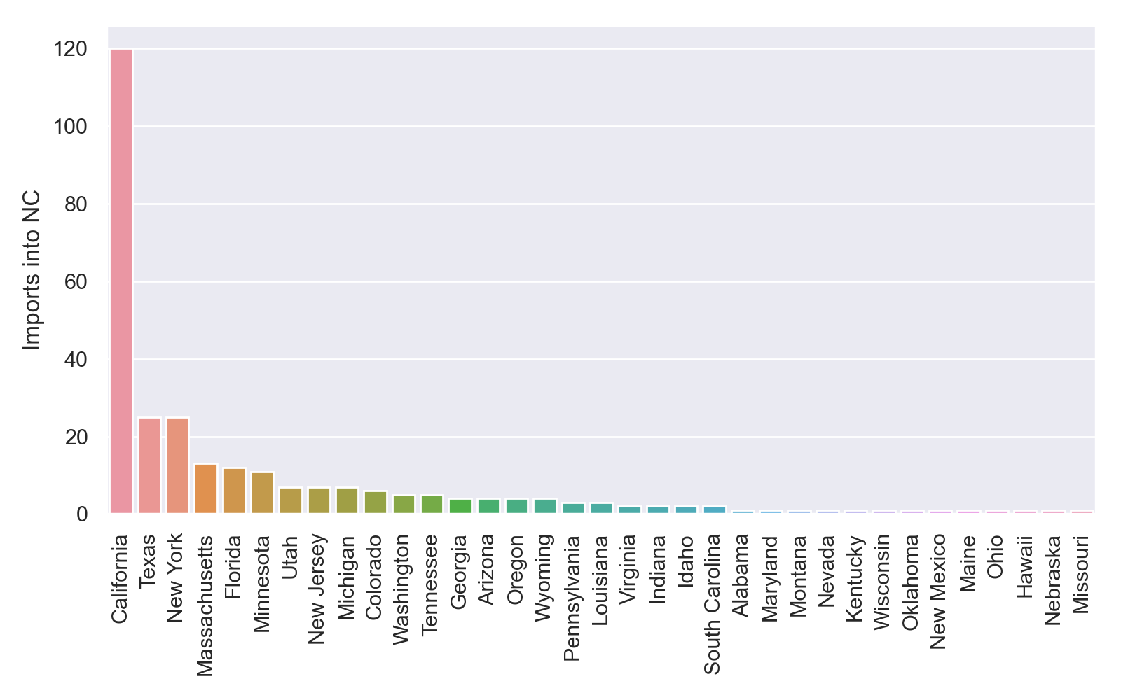
This is what my plot looks like, although yours may look different because I used an earlier tree generated by RAxML before it completely finished running:
We can do the same exact thing for exports from NC:
# Plot exports into NC
fig, ax = plt.subplots(figsize=(8, 5))
exports_by_state = exports_df['Destination'].value_counts()
sns.barplot(exports_by_state.index, exports_by_state.values)
ax.set_ylabel('Exports into NC')
plt.xticks(rotation=90) # rotate xtick labels so readable
fig.tight_layout()
fig.savefig('nc_exports_per_state.png', dpi=200)
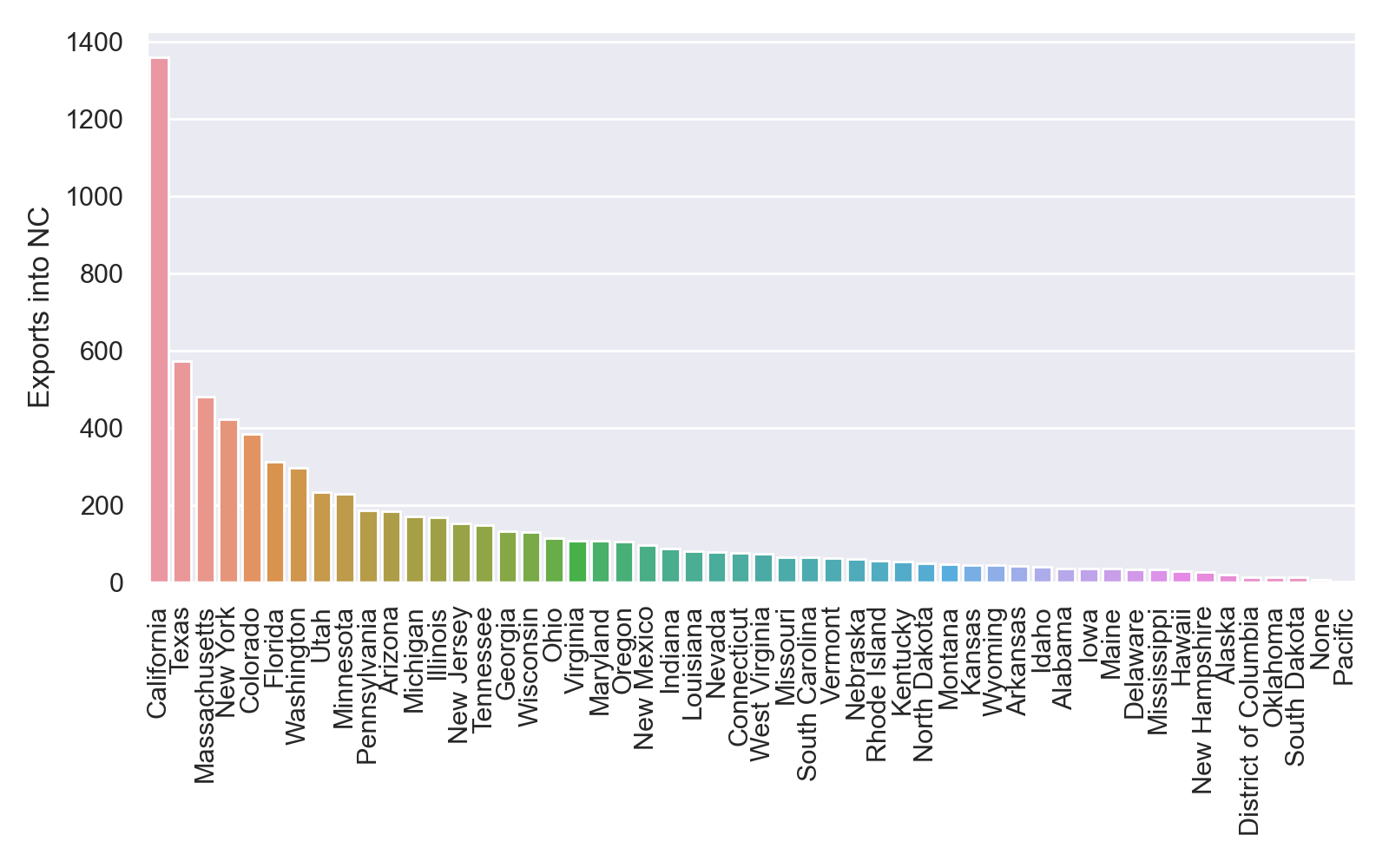
At first glance, it appears that that there were far more exports from than imports into NC. But this seems suspicious since we sampled far more from NC than other states. Furthermore, most of the identified imports/exports were between NC and other states like California, Texas and New York that were better represented in our dataset. How can we explore how much these results depend on how much we sampled from each state?
Resampling and rarefaction
One way we can explore how the number of imports/exports identified for a given location depends on sampling from that location is through rarefaction. We can systematically vary the fraction of samples included from that location, resample from our full dataset using that sampling fraction, and then rerun our movement analysis. The full script to run the rarefaction analysis is called rarefaction.py, but let’s first break things down step-by-step.
Here, we will systematically vary the number of samples from NC. So after loading in our metadata into a dataframe again, the first thing we will do is split the dataframe between samples from NC and samples from the rest of the US:
#Split df by nc/external
nc_df = meta_df[meta_df['State'] == 'North Carolina']
us_df = meta_df[meta_df['State'] != 'North Carolina'] # != means "not equal to"
Next we choose the sampling fractions we want to use for the rarefaction analysis. Here we will vary the sampling fraction from NC from 0.1 to 1.0 in increments of 0.1. We can also pick the number of times we wish to resample at each sampling fraction to explore the effects of sampling variation but here we will just run one sampling replicate at each sampling fraction.
# Rarefaction params
sampling_fractions = np.arange(0.1,1.01,0.1) # sampling fracs to use in rarefaction analysis
sampling_reps = 1 # number of replicates to run at each sampling frac
At each sampling fraction, we can use Panda’s sample function to subsample a given fraction s of samples from NC. After subsampling, we can than merge (concatenate) our subsampled dataframe from NC with the samples from the rest of the US in us_df and get a list of all the accession IDs in our newly sampled dataset:
# Subsample a given fraction of NC samples"
sub_df = nc_df.sample(frac=s, axis=0)
merged_df = pd.concat([us_df, sub_df], axis=0) # Merge external df with subsampled df
subsampled_accessions = merged_df['Accession ID'].tolist()
Our rarefaction analysis would run very slowly if we needed to completely reconstruct a tree for each subsampled dataset from scratch. So instead here we will prune our already reconstructed tree to remove all of the taxa (samples) not included in our subsampled data. We can do this in DendroPy using the extract_tree_with_taxa function to extract a subtree including only the taxa we want to retain. Note that because DendroPy removes underscores in taxa names from Newick and Nexus files, we need to replace all of the underscores in our accession names with spaces for the taxon names in subsampled_accessions to be consistent with their names in the tree:
# Extract subtree with non-sampled taxa pruned
subsampled_accessions = [t.replace('_',' ') for t in subsampled_accessions] # replace underscores with spaces to match how dendropy taxon names
taxa_to_retain = set([taxon for taxon in tree.taxon_namespace if taxon.label in subsampled_accessions])
subsampled_tree = tree.extract_tree_with_taxa(taxa=taxa_to_retain)
With our subsampled tree, we can rerun our ancestral state reconstruction and identify all of the changes in ancestral locations that have occurred at migration events. As before, we first need to create the tip_state_dic dictionary that maps samples in the tree to their sampling location. We then call the ancestral_changes function on the tree to find all of the migration events based on the new reconstruction.
# Rerun MP ancestral state reconstruction for all features
tip_state_dic = {}
for index, row in merged_df.iterrows():
    tip_state_dic[row['Accession ID']] = row['State']
anc_tree = reconstruct_MP(subsampled_tree,tip_state_dic)
changes_df = ancestral_changes(anc_tree) # Find changes in state along tree
Using the migration events identified in changes_df we can then find all of the imports into NC and exports from NC and count them.
# Find imports/exports
imports_df = changes_df[changes_df['Destination'] == 'North Carolina']
import_count = len(imports_df.index)
print("Found " + str(import_count) + " imports")
exports_df = changes_df[changes_df['Origin'] == 'North Carolina']
export_count = len(exports_df.index)
print("Found " + str(export_count) + " exports")
We can store our results on the number of imports and exports at each sampling fraction in lists for now:
# Add results to lists for plotting
s_fractions.append(s)
imports.append(import_count)
exports.append(export_count)
Once we’ve rerun our analysis at each sampling fraction, we can place our results in a dataframe and save them to a csv file for later use.
df = pd.DataFrame({'SamplingFraction':s_fractions,'Imports':imports,'Exports':exports})
df.to_csv('rarefaction-results-NC.csv')
Finally, let’s plot the results for our rarefaction analysis to see how the number of exports from NC depends on how much we’ve sampled from NC:
sns.set(style="darkgrid")
fig, axs = plt.subplots(figsize=(6,4))
sns.lineplot(x='SamplingFraction',y='Exports',data=df, linewidth=2, dashes=False)
axs.set_xlabel('NC sampling fraction', fontsize=14)
axs.set_ylabel('Exports from NC', fontsize=14)
plt.tight_layout
plt.savefig('nc_exports_bySampleFrac.png', dpi=300, bbox_inches="tight")
Here we can see that the number of exports identified from NC rapidly increases with the sampling fraction, but plateaus at the highest sample fraction.
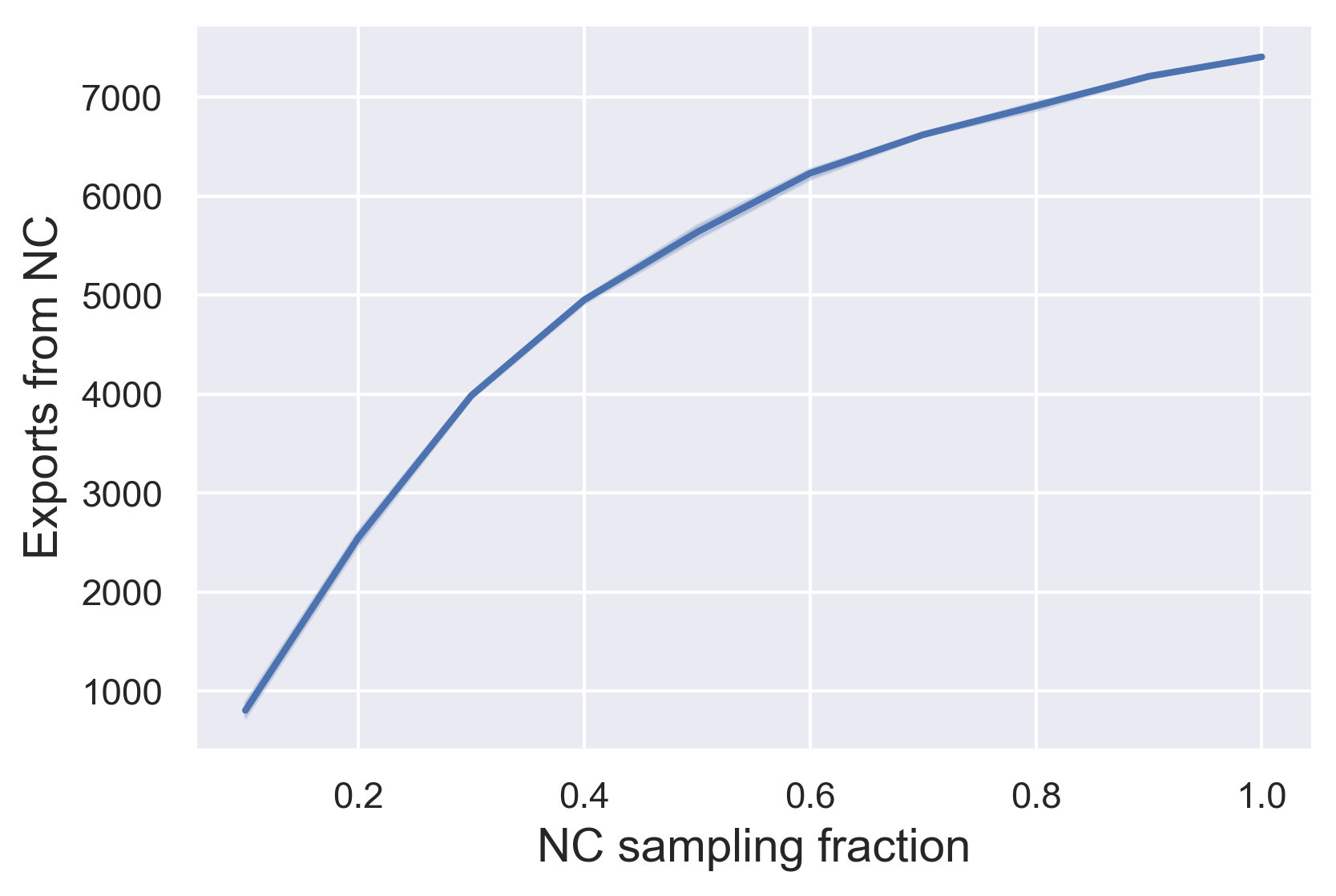
This would suggest that we’ve sampled sufficiently from NC in our full dataset to identify most of the exports from NC. But what if we had sampled more extensively from other states as well? Do you think we would continue to find more exports from NC as we increase our sampling efforts in other states?