Coalescent Skylines in BEAST
What you will need:
-BEAST 2.5.0 or greater
-Tracer 1.7.0 or greater
-FigTree
Inferring seasonal flu dynamics using the Coalescent Bayesian Skyline
The epidemic dynamics of rapidly evolving pathogens can strongly shape their phylogenetic history. It is therefore often possible to reconstruct past epidemic dynamics from information contained within pathogen phylogenies. In this tutorial we will reconstruct changes in effective population sizes through time using the Bayesian Coalescent Skyline plot (Drummond et al., 2005), which uses a flexible non-parametric approach to model how population sizes change through time.
To motivate this exercise, we will consider the seasonal dynamics of influenza A virus subtype H3N2 in North Carolina. Since the late 1960’s, H3N2 has been responsible for most of the seasonal influenza cases worldwide. The virus undergoes periodic antigenic changes in the hemagglutinin (HA) protein, which allows the virus to escape human immunity elicited by previous infections with other influenza strains or vaccines. Large antigenic changes can result in especially severe seasonal epidemics, especially when there is an antigenic mismatch between circulating strains and the recommended flu vaccine, such as in the 2014-15 and 2017-18 flu seasons.
But what about the epidemic dynamics of the virus itself? Do more people become infected during severe flu seasons because the virus is more transmissible, or do these viruses just cause more severe symptoms? To find out, we will perform a phylodynamic analysis of H3N2 sequences sampled over the past 10 years in North Carolina.
The Sequence Data
All influenza hemagglutinin (HA) sequences were downloaded from the Influenza Research Database, taking all H3N2 subtype sequences collected in North Carolina from 2010 to 2019. This is the same dataset we aligned in the Week 1 tutorial. You can download the alignment as a FASTA file here.
Setting up the Coalescent Skyline
Open BEAUTi and import the aligned sequences by selecting File → Import Alignment. BEAUti should recognize the sequences as nucleotide data, but if not choose nucleotide from the list of datatypes that pops up.
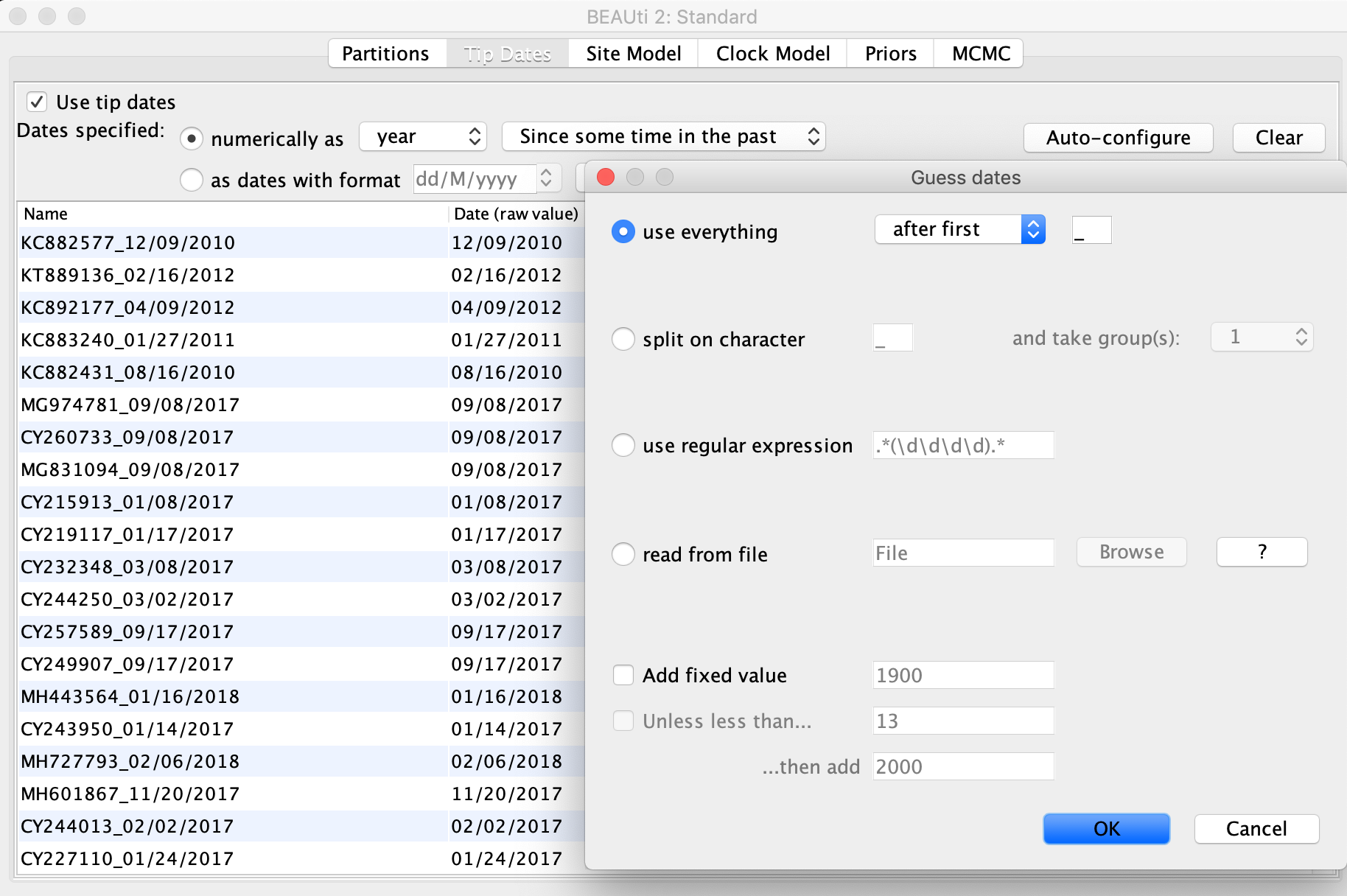
Next click the Tip Dates tab at the top of the window and check the Use tip dates box on the left. This should bring all of the sequences you just imported into view. We now need to tell BEAUTi the sampling date of each sequence. To do this, first select the as dates with format option and choose M/dd/yyyy from the dropdown menu. Then click the Auto-configure button to have BEAUti parse the sampling dates from the sample names. As you can see, each sample is named with the sample date following the underscore. So with the use everything option selected, pick after first from the drop down menu and leave the underscore in the box to the right. Once you click OK, BEAUti should automatically fill in the correct dates in the table.
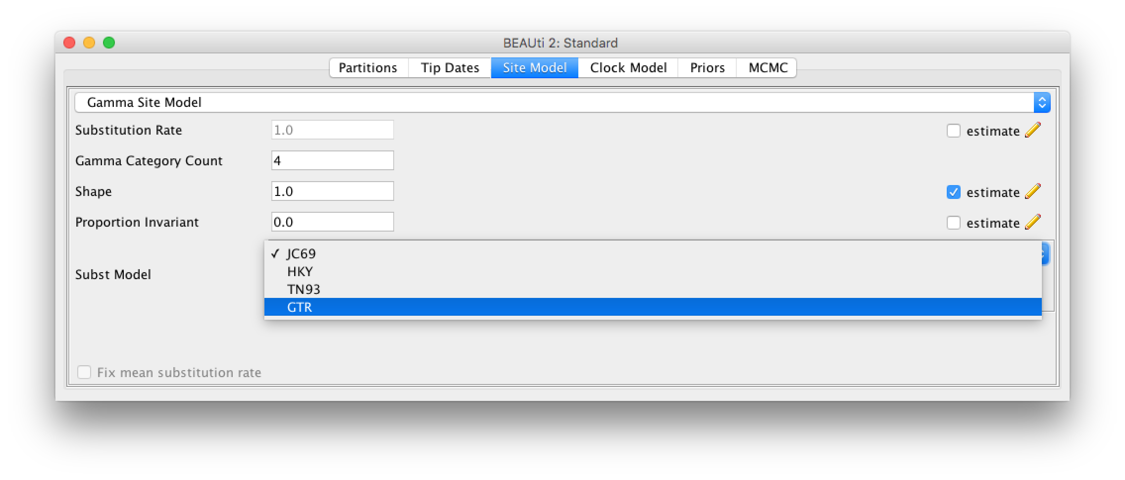
Click the Site Model tab at the top of the window to specify a model of molecular evolution. We will use the General Time Reversible (GTR) model. The GTR model is generally appropriate for rapidly evolving pathogens like influenza when we know that there is enough nucleotide diversity in the sequence data to estimate substitution rates between each pair of nucleotides. Additionally, we will allow for rate heterogeneity among sites by changing the Gamma Category Count to 4. This adds some flexibility, as it allows different sites to evolve at slightly different rates. We can also select the estimate box next to Proportion Invariant if we want to assume that no substitutions are allowed at a fraction of sites and are thus completely invariant across all sequences in our sample.
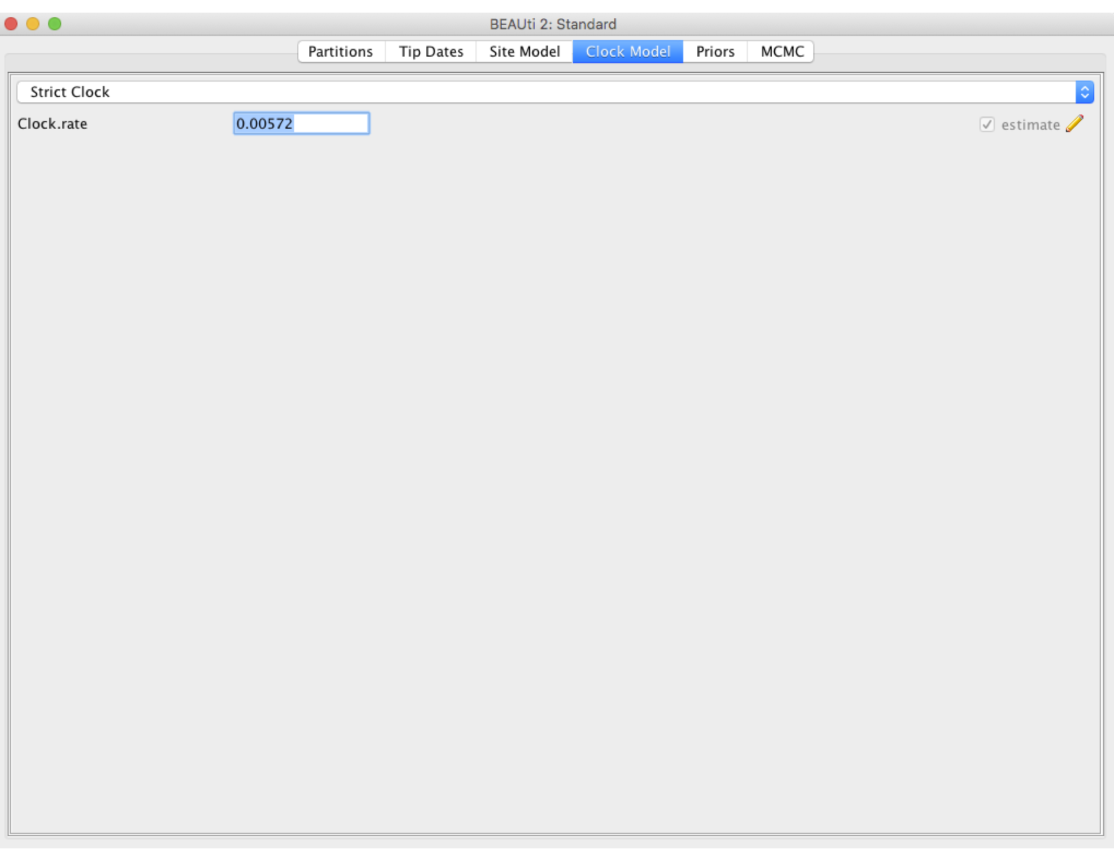
Next click the Clock Model tab to set up the molecular clock model. Our sequence samples are collected serially over time, so we can estimate the clock rate from the number of substitutions that have accumulated between the root of the tree and the sampling times. We will therefore estimate the clock rate from the sequence data. However, it can take BEAST a while to converge on reasonable clock rate estimates unless we provide a good initial guess. So we will set the initial clock rate at 5.72 X 10^-3 substitutions per site per year, which was previously estimated from a large H3N2 dataset with samples spanning a much longer time period (Rambaut et al., 2008). Leave the Strict Clock option selected in the menu at top and type this rate into the Clock.rate box.
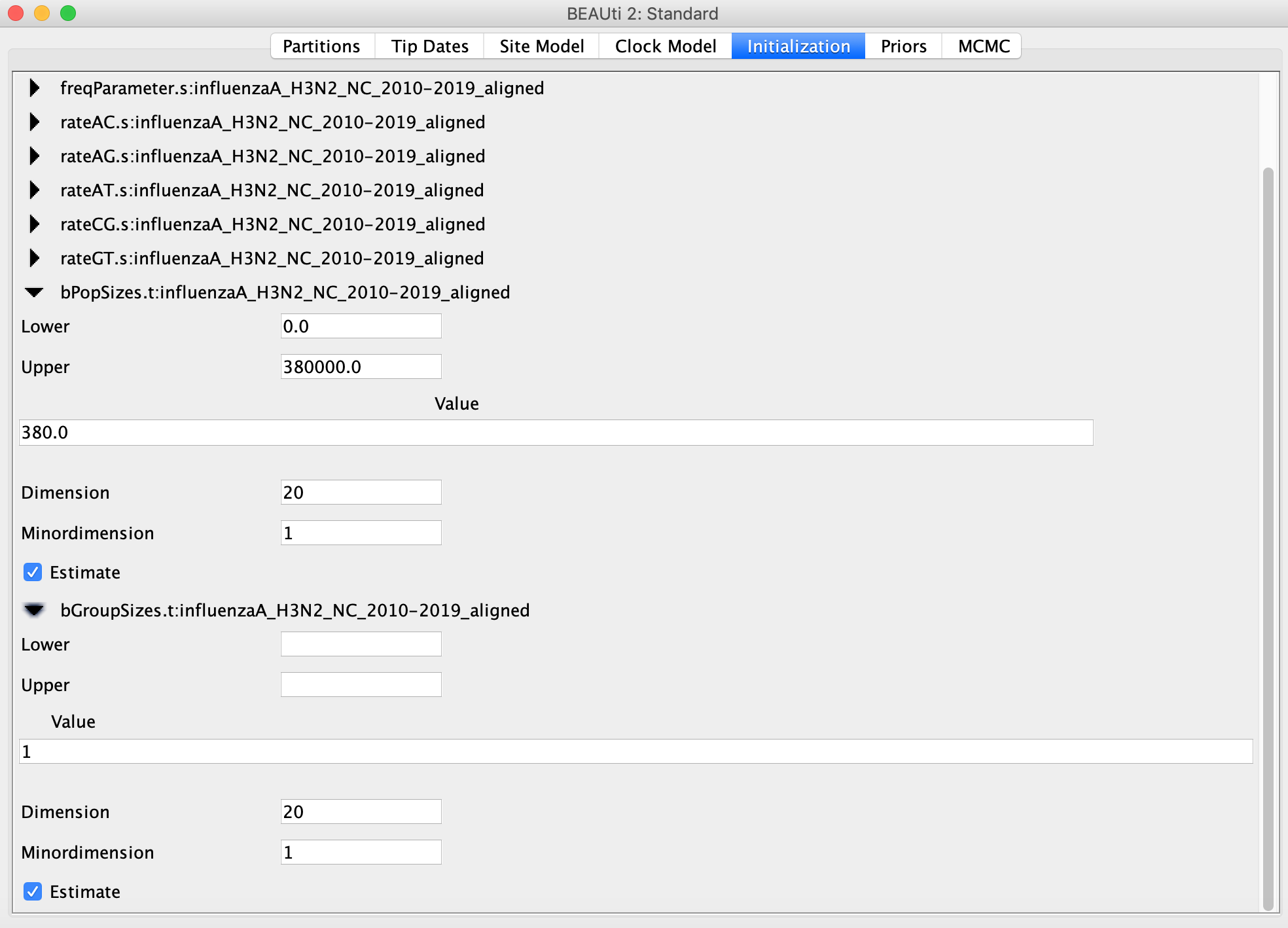
Now go to the Priors tab and select the Coalescent Bayesian Skyline as the tree prior. The Skyline works by dividing the time between the present and the root of the tree into a set of intervals. The Skyline method in BEAST will estimate the number of coalescent events within each interval (which is captured in the Group Size parameter) as well as the effective population size for that interval. The number of intervals is equal to the dimension specified. If we have d intervals, the effective population size is allowed to change d-1 times. To specify the number of dimensions, we need to first go to the initialization panel, which can be made visible by clicking View → Show Initialization Panel.
For this analysis we will set the number of dimensions to 20 (the default value is 5). Keep in mind that one has to change the dimension of bPopSizes together with bGroupSizes so that the dimensions of both parameters match. Choosing the dimension for the Skyline can be rather arbitrary. If the dimension is chosen too low, not all population changes are captured, if it is chosen too large, there might be too little information in an interval to obtain a reliable population size estimate. The rationale for choosing 20 is that we have samples spanning 10 flu seasons with an off season (i.e. the summer) separating each season, so we can reasonably expect to capture flu’s seasonal dynamics with this many intervals.
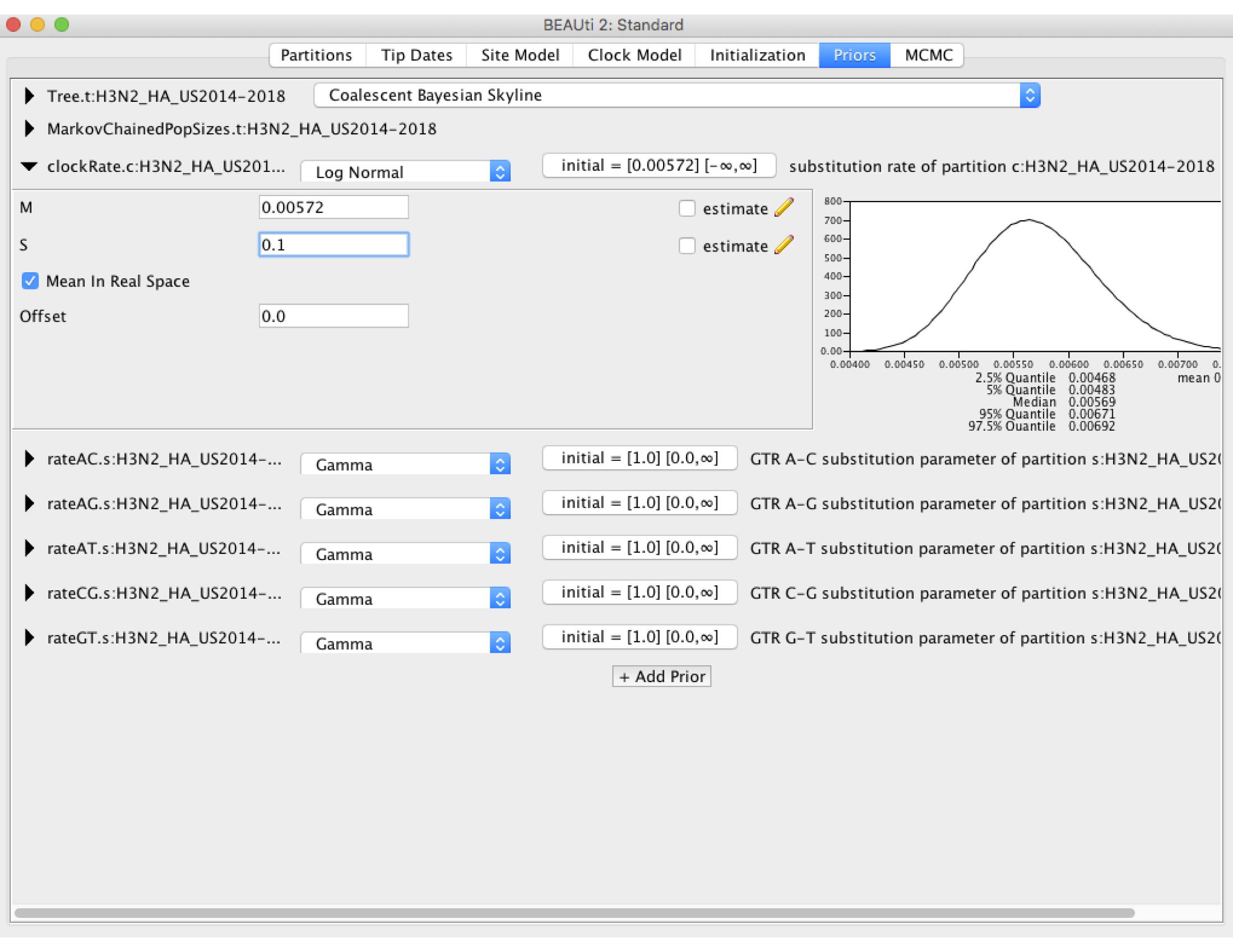
Now we need to set some priors on our parameters. Under the Priors tab set the prior on the clockRate to Log Normal, then click on the black arrow pointing at the clockRate parameter. In the box the drops down, set the mean (M) to the previously estimated value of 5.72 X 10^-3. Make sure the Mean In Real Space box is checked, as the Log Normal prior would otherwise expect us to set the mean on a log scale. We will set the standard deviation (S) to 0.1. As you can see in the figure below, this places most of the prior density on a fairly narrow range of values between 4.5 X 10^-3 and 7.0 X 10^-3. This is what we refer to as specifying an informative prior: we are using our prior belief about the clock rate obtained from earlier studies to constrain our estimates to fall within the range of values we believe are most probable. This is perfectly valid here because the clock rate for H3N2 has been estimated before using much larger sequence datasets, so that we can feel reasonably confident in our prior beliefs. We will leave the priors on all other parameters at their default values.
Click on the MCMC tab and set the chain length to 3 million. This may not be long enough to obtain a high effective sample size from the posterior for all parameters, but it should allow the analysis to run in one or two hours. We can always go back and run the chain for longer!
Finally go to File → Save to save the settings in an XML file named something like influenzaA_H3N2_NC_2010-2019_skyline.xml. You can now run BEAST with this XML file. It might take some time for the MCMC to run, so while that’s happening let’s take a minute to think about effective population sizes for infectious pathogens.
Effective Population Size
It is important to remember that the Coalescent Skyline infers changes in effective population size \(N_{e}\), which is related to but not the same as the number of infected individuals. We can infer changes in \(N_{e}\) from the rate at which lineages coalesce in the phylogeny. Basic coalescent theory tell us that the rate at which two lineages coalesce \(\lambda\) is inversely proportional to \(N_{e}\):
\[\lambda = \frac{1}{N_{e}}.\]Thus the larger the effective population size \(N_{e}\), the less likely two lineages are to coalesce. This simple logic allows us to infer changes in population size from phylogenetic trees.
But the equation given above is really for the coalescent rate per generation. This is fine for a population with a fixed generation time but needs to be interpreted carefully for an infectious pathogen where transmission events occur continuously though time. Here, one generation corresponds to one round of transmission between hosts. So we can write the coalescent rate as
\[\lambda = \frac{\theta}{I},\]where \(I\) is the size of the infected population and \(\theta\) is the rate at which transmission events occur (see Volz et al., 2009). The problem here is that the transmission rate normally changes during the course of an epidemic as the number of susceptible hosts change (i.e. \(\theta = \beta S\) in the standard notation of SIR-type models). Thus, \(N_{e}\) inferred from a phylogeny is no longer directly proportional to the number of infected individuals, but also depends on the transmission rate. Nevertheless, changes in \(N_{e}\) can normally be used as a reasonable proxy for the epidemic dynamics.
Exploring the Skyline results
If BEAST is taking a long time to run, you can continue the tutorial using my precooked .log and .trees files.
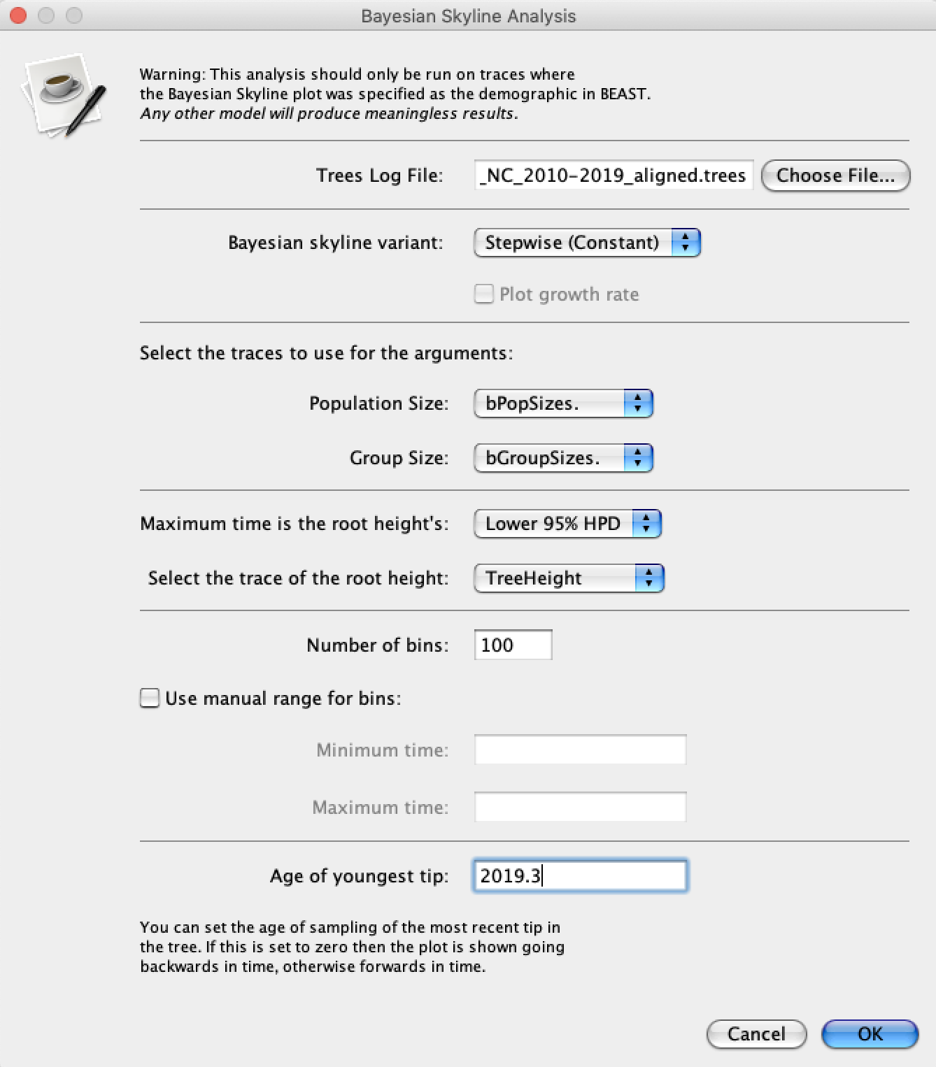
Either way, open Tracer and load the .log file. To run the Skyline analysis, navigate to Analysis → Bayesian Skyline Reconstruction. For the Trees Log File choose the .trees file from your BEAST run. We can also specify the sampling time of the youngest (most recent) tip in the tree so that time will be given in calendar years. To do this, set the Age of the youngest tip to 2019.3 – the sampling time of our most recent sample. Now press the Ok button and wait a moment while Tracer performs our analysis.
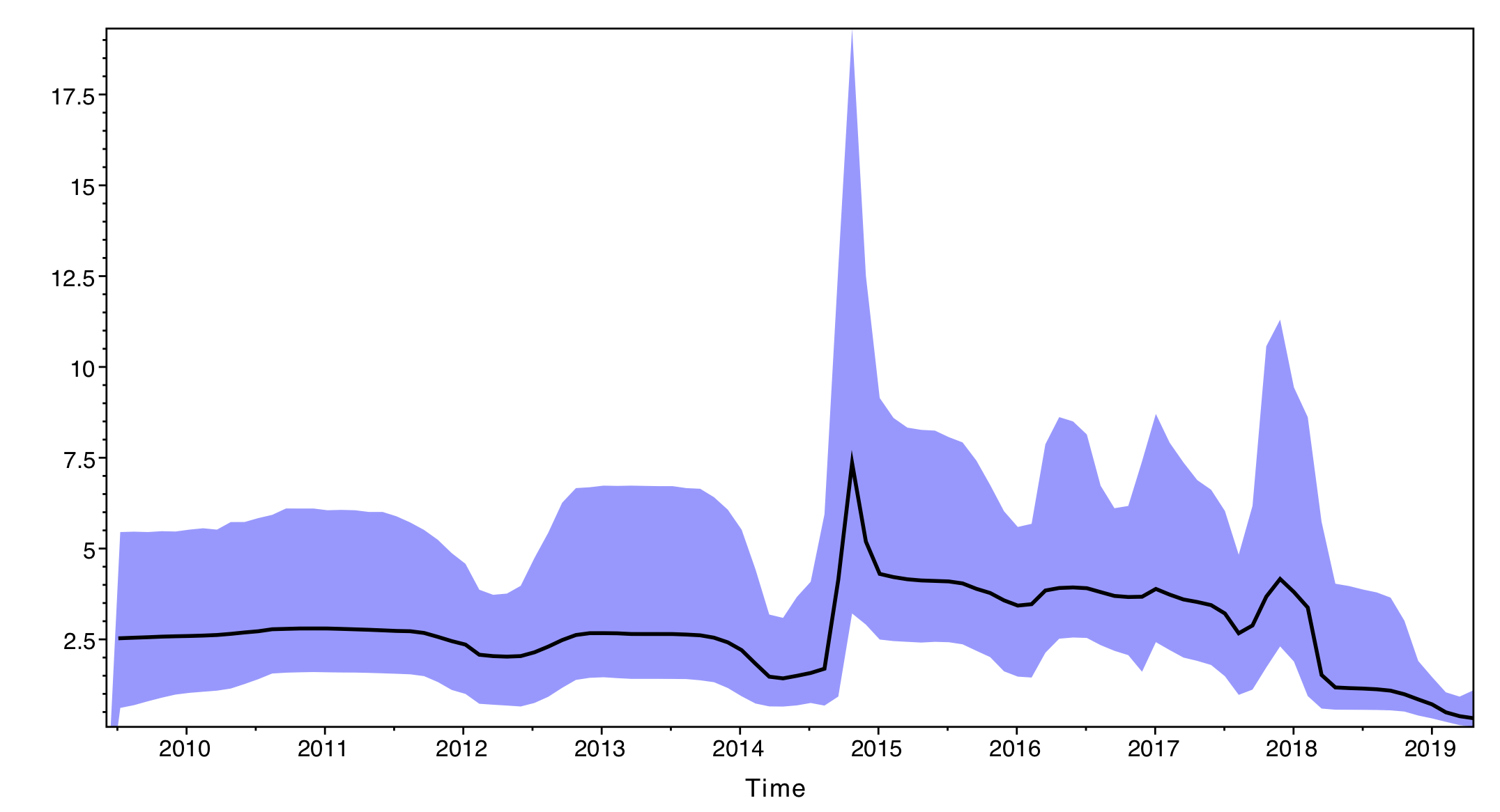
The output will have the years on the x-axis and the effective population size through time on the y-axis. By default, the y-axis is on a log-scale.
If everything worked as expected you should see a sharp peak corresponding to the severe 2014-15 flu season. What do you see for the more recent flu seasons?
The results of the Skyline analysis can either be saved as a PDF or a tab delimited file. To save it as a tab delimited file, select File → Export Data. The exported file will have five rows for the time and the estimated mean, median, lower and upper 95% credible intervals.
To make sense of our results, we can compare the Coalescent Skyline analysis with the reconstructed phylogeny. To get a summary of the posterior set of trees, open TreeAnnotator (packaged with BEAST). For the Burnin percentage select 20%, leave the Target tree type as Maximum clade credibility tree and choose the .trees file for the Input Tree File. You will also need to choose an Output File named something like mcc.tre. After running TreeAnnotator, you can open the MCC tree in FigTree. Do the effective population size estimates make sense with respect to the inferred phylogeny?
Optional: Custom Skyline plots in Python
Tracer does not allow for much customization of the Skyline plots. Fortunately, we can easily export the data and then plot it other software like R, Matlab, Excel, ect. Here we will plot the Skyline reconstruction using the Matplotlib package in Python. We will also use the Seaborn package, which builds upon Matplotlib to generate more visually appealing figures with almost no extra work.
Tracer rather unhelpfully places an extra line of text in the first line of the exported tsv file above the column names, which will prevent other programs from properly parsing the data. So first open the tsv file in your favorite text editor and delete this line.
Download the linked plot_skyline.py script and the cdc_state_ILI_reports.csv data file. Store these files in the same folder/directory as the nc_flu_skyline_data.tsv file you exported from Tracer.
The plot_skyline.py script will plot the Skyline plot, but before running the script let’s first walk through the code. The first thing we need to do is import the data Tracer exported from the Skyline analysis. I named the tsv file nc_flu_skyline_data.tsv, so change the name of the tsv_file variable in the code if you named your file something different. We will then use Pandas to import the data from the tsv file as a dataframe df.
import pandas as pd
tsv_file = 'nc_flu_skyline_data.tsv'
df = pd.read_table(tsv_file, sep="\t")
We can then plot our Skyline reconstruction of effective population sizes. First we will plot the median estimate as a line plot using Seaborn. We can then add the 95% credible intervals using Matplotlib’s fill_between function. We will store the limits of the x-axis as date_lim to use later.
import matplotlib.pyplot as plt
import seaborn as sns
sns.set()
sns.lineplot(x="Time", y="Median", data=df, ax=axs[0])
axs[0].set_ylabel('Effective size', fontsize=12)
axs[0].set_xlabel('') # no label
axs[0].fill_between(df['Time'], df['Lower'], df['Upper'], alpha=.3) # alpha val sets transparency
date_lim = axs[0].get_xlim()
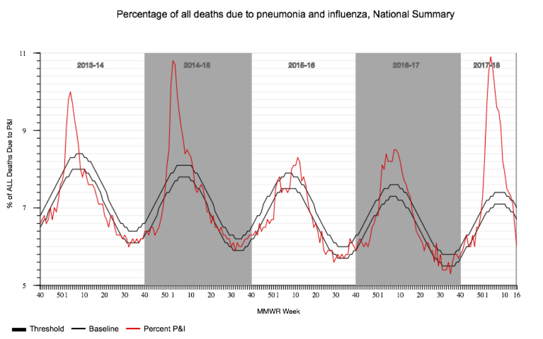
We can now compare our Skyline reconstructions to the CDC’s data on influenza-like illnesses (ILI) in North Carolina. Note that the CDC does not directly track the number of influenza cases, but the percentage of deaths due to pneumonia and influenza during each week of the year. This data is provided by the National Center for Health Statistics Mortality Surveillance System and available from the FluView webpage.
The csv file cdc_state_ILI_reports.csv contains the ILI data from all US states from 2013 on. We will first load the data as a Pandas dataframe, and then grab all rows in the data from North Carolina using df[df['SUB AREA'] == 'North Carolina']. The CDC provides the dates in terms of the calendar week of each flu season. To make this more easily plot-able, we will convert calendar weeks into decimal years using the convert_dates function contained within the plot_skyline.py script.
"Read in ILI data from CDC"
csv_file = 'cdc_state_ILI_reports.csv'
df = pd.read_table(csv_file, sep=",")
df = df[df['SUB AREA'] == 'North Carolina'] # get entries for North Carolina
df['DATES'] = convert_dates(df) # convert flu season weeks to decimal years
We can then plot the CDC’s ILI data as a line plot using Seaborn. We will plot this in a second subplot since the data are on a different scale than the effective population sizes. Finally, we will set the x-axis limits so that both subplots share the same time span.
"Plot ILI data in second subplot"
sns.lineplot(x="DATES", y="PERCENT P&I", data=df, color='darkorange', ax=axs[1])
axs[1].set_xlabel('Time')
axs[1].set_xlim(date_lim) # set xlim so subplots have same x-axis
Finally we will save the figure as a png file called nc_flu_skyline_vs_ILI.png:
"Save image"
fig.set_size_inches(6, 6)
plt.show()
img_file = 'nc_flu_skyline_vs_ILI.png'
fig.savefig(img_file, dpi=200)
Now you can run the plot_skyline.py script in Python from the command line. But make sure you run the script from the same directory that contains the cdc_state_ILI_reports.csv and nc_flu_skyline_data.tsv files.
python plot_skyline.py
If all goes well, you should now have a plot that looks like this:
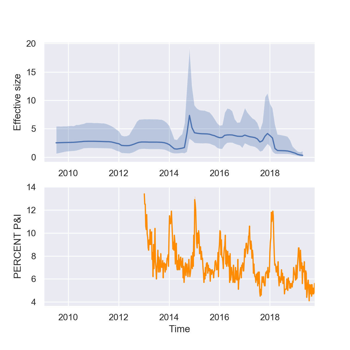
What do you think of our reconstructions? Are you impressed? While it seems like we can pick up some of trends in seasonality and major peaks in the 2014-15 and 2017-18 flu seasons, the seasonal fluctuations are overall less dramatic in the Skyline reconstruction. But keep in mind that there are multiple different forces shaping the viral phylogeny other than flu’s population dynamics, so Skyline reconstructions will generally not perfectly mirror epidemic dynamics.
Acknowledgments
This tutorial was based on an earlier tutorial by Nicola F. Müller and Louis du Plessis.